Thank you for reading this note carefully. Following the instructions can reduce a lot of communication costs and avoid the miscommunications and misunderstandings between design and production.
1.Clarity and Details
You can place the keycap on the screen as a reference and the diagram is scaled to the actual size. If the design can be seen by the naked eye on the screen then it can be easily produced; if the details are difficult to identify it is possible that it will be difficult to recreate on an actual keycap.

2.Color Space
“RGB” is the standard color space for most pixel images shared on web. But we recommend using “CMYK” as the color space when designing for dye-sub colors. CMYK has a smaller range of colors but is closer to reality.
3.Monitor Color Difference
Monitors are not ideal to use as a reference standard for color comparison. For higher color requirements, we prefer to use Pantone or RAL color rings. Before deciding on a color, please be sure to observe the colors in person with a color ring rather than on a monitor.
Note:
- Color rings will fade over time, so please update your color rings annually to ensure accuracy and consistency.
- If a non-universal model color card is used, the designer will need to provide the physical color sample.

4.Lightness
Affected by the ink and the base injected color of the keycap, the brighter the color the more difficult it is to produce, such as fluorescent/neon colors. Although some color rings also have these colors, but they are very difficult to reproduce with dye-sub inks.
5.Stretching and Fading
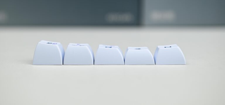
Stretching and fading are often observed on the side walls of a reverse dyed keycap. The taller the profile a keycap has, the more severe the stretching is. If the side of the keycap is in a single color, the color will have the risk of fading. Even if we compensate for the ink loss and image strectching during the pull with computer calculation, they are impossible to avoid. However, there is no need to worry about fading with a pure black side wall. We use a high concentration of black ink for printing to eliminate the fading. But this process will take longer for the ink to dry and cure and lead to a longer production timeframe.
6.Color Difference Standard
In dye-sub production, the acceptable color difference test result between the mass produced products and the prototype sample is: △E < 2. The acceptable result among the keycaps from the same production batch is △E < 1.5. Keycaps have a different texture than the paper color reference sheets, and the difference are usually difficult to be detected. We will try to match the color to be close to the paper reference.